Blog Post
Next Generation of Objective Keystone
The Revamped Objective Keyplan Experience
The Revamped Objective Keyplan Experience
Objective Keyplan, the collaborative authoring and stakeholder engagement tool, has embraced this philosophy and undergone a transformative makeover, bringing forth a brand new look and feel that aims to redefine simplicity and efficiency. In this blog post, we'll take a closer look at the key UX/UI improvements that have been introduced.
Simplifying Complexity: The Vision Behind the Redesign
To better understand the driving force behind Objective Keyplan, we turned to Andrew Karrasch, the Design Lead who collaborated with Objective Keystone customers across the globe.

Andrew Karrasch
Design Lead
A consistent theme in colour usage, font sizes, and iconography has been implemented to create a cohesive, customer-centric digital portal.
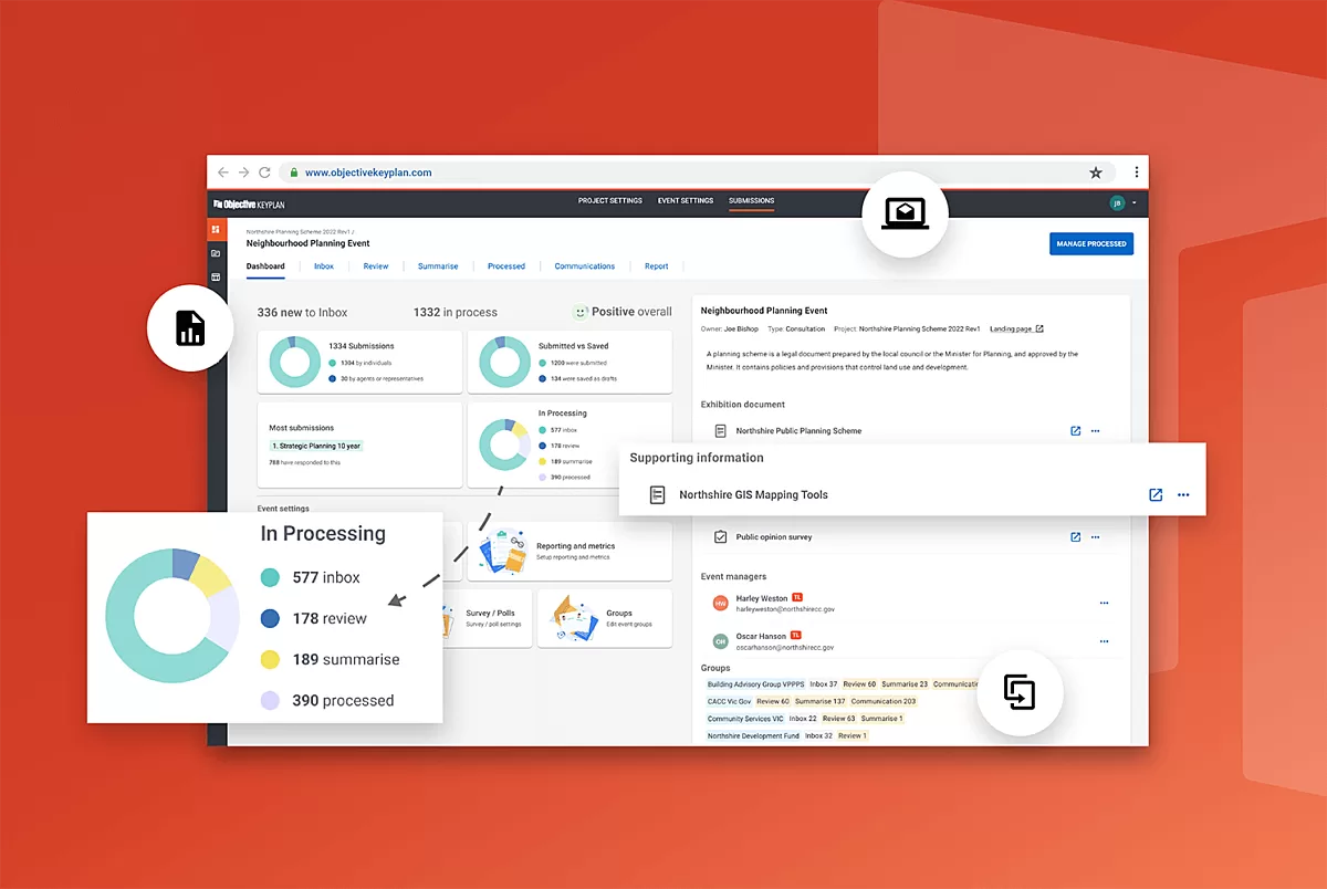
A Revamped Dashboard for Enhanced Insights
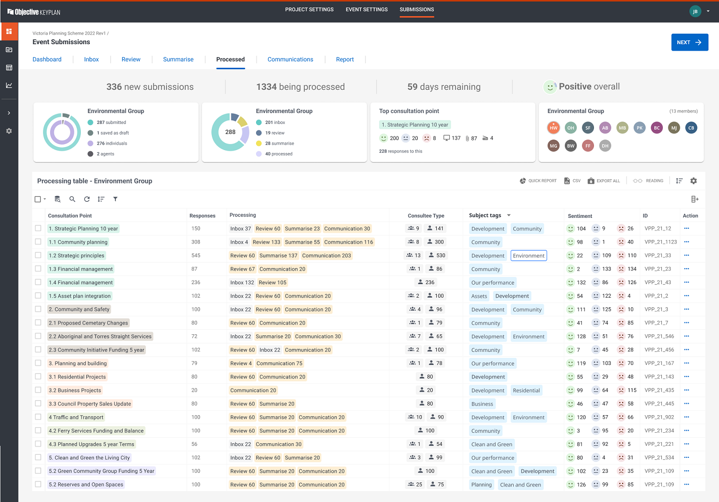
The redesigned dashboard is undoubtedly one of the highlights of the new Objective Keyplan. It now presents users with a range of useful charts and information, providing an instant snapshot of their consultation progress and upcoming events. Planners can now easily track the status of their consultations, thanks to the intuitive navigation and improved interface.
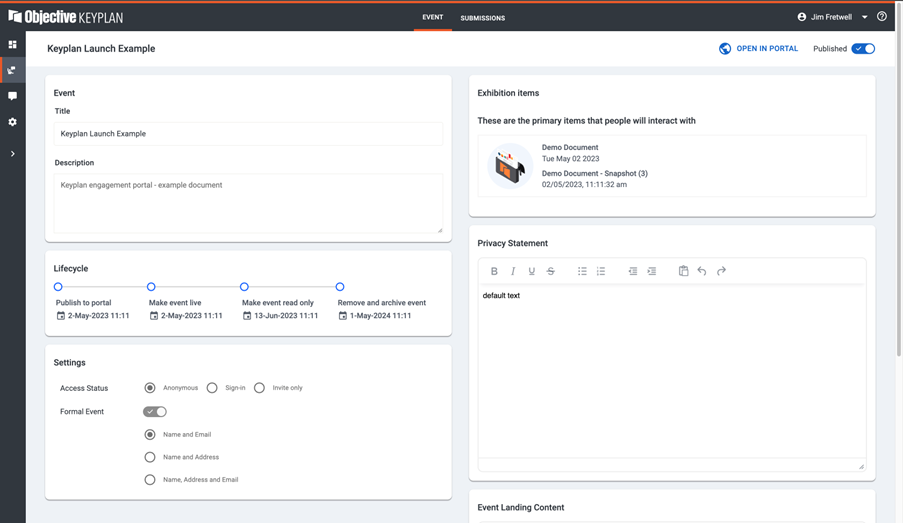
Seamless Event Planning with Added Features
Event planning is now a breeze with the introduction of various event configurations. The new event Lifecycle timeline offers complete visibility for each milestone, empowering users with deeper insights into the core capabilities of the product. This enhancement significantly streamlines the planning process, making it more efficient and effective.
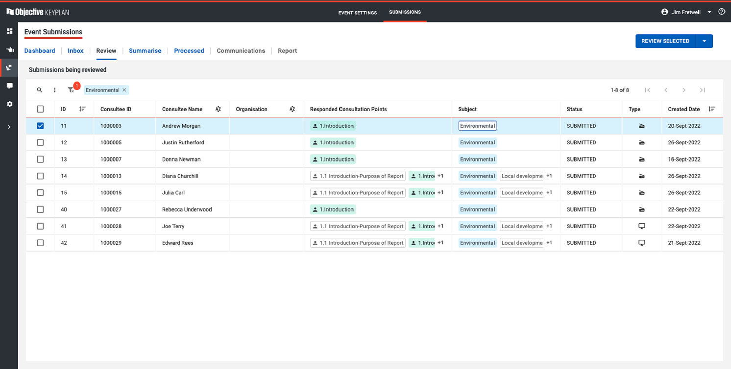
Optimised Submission Management
Objective Keyplan's Submission Management platform has been optimised to offer customer-specific details, including Consultee Name, Responded Consultation Points, Date, and Status. Additionally, the ability to add Subject Tags allows comments to be tagged to specific themes as defined by Planners. This comprehensive approach to managing submissions ensures that users can easily keep track of feedback and engage with the community more promptly.
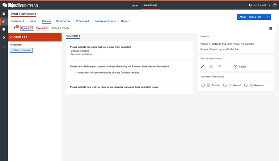
User-Friendly Comment Processing
Processing comments is now more user-friendly than ever, thanks to the addition of a range of emojis to assign sentiments to each response. This simplifies the feedback analysis process and helps users understand the emotional context behind each comment more intuitively.
Enhanced Reporting Interface
The new Reporting user interface has been designed with a focus on ease of consumption. Users are presented with a visually appealing table that incorporates a variety of colours, icons, and headings that highlight the most critical information. By listening to customer feedback and prioritising essential data, the reporting interface empowers users to make informed decisions more efficiently.
Putting the User First
Throughout the redesign process, Andrew and the design team remained committed to putting the user first. By actively listening to their customers' pain points and requirements regarding community consultation, the team was able to create an interface that truly addresses their needs. This customer-centric approach ensures that the software aligns with users' expectations and enables them to navigate the platform seamlessly.
The new and improved Objective Keyplan sets a new standard for collaborative authoring and stakeholder engagement tools. With its fresh and intuitive interface, simplified navigation, and enhanced reporting capabilities, it offers a highly interactive user experience. By putting the user at the centre of the design process, the design team has succeeded in creating a digital portal that not only meets but exceeds user expectations, paving the way for more effective and streamlined consultation experiences.